
Cart
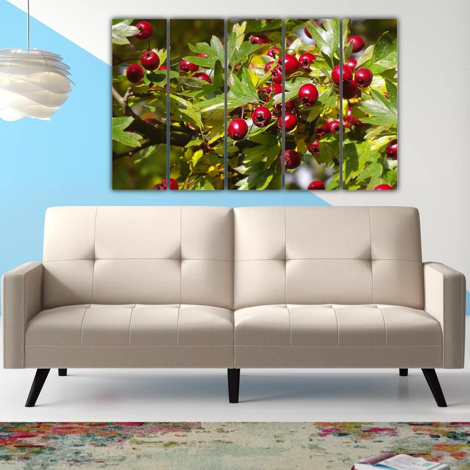
You've measured your living room wall three times. Maybe four. The tape measure says 360cm, but you're still not confident because online photos never show real Indian rooms. Every guide says something different about proportions, and none account for your cream walls or that brown sofa underneath. You keep second-guessing: is 127cm actually right, or will it look like a postage stamp above your 7-foot sofa?
Here's what the math actually shows. A 127cm canvas on a standard 12-foot (360cm) wall covers roughly 35% of the horizontal space—leaving about 116cm breathing room on each side. That's the sweet spot interior designers call "balanced coverage." Go smaller at 90cm, and you're down to 25% coverage—the art starts looking like an afterthought. Go larger at 150cm, and you're pushing 42%—bold, but potentially overwhelming if your room is under 14 feet wide.
Your wall is probably 360cm wide (standard 12-foot living room). This 5-panel piece spans 127cm horizontally, which means:
Coverage calculation: 127 ÷ 360 = 35.2% wall coverage
That leaves 233cm of wall space—roughly 116cm on each side if centered. Above a typical 7-foot (213cm) sofa, this creates what designers call the "rule of two-thirds"—the art spans approximately 60% of your sofa's width, which reads as intentional rather than accidental.
Height consideration: At 76cm tall, this piece works with standard 9-10ft ceilings. Hung 15-20cm above your sofa's backrest, the top edge sits at roughly 180-190cm from the floor—comfortable eye level whether you're standing or seated.
What if you went smaller? A 90cm piece would cover just 25% of that same wall. Above a 7-foot sofa, it would span only 42% of the sofa width—looking like you couldn't afford the right size.
What if you went larger? A 150cm piece covers 42% of your wall. Works if your living room exceeds 14 feet, but in a standard 12x14ft room, it starts crowding the visual space.
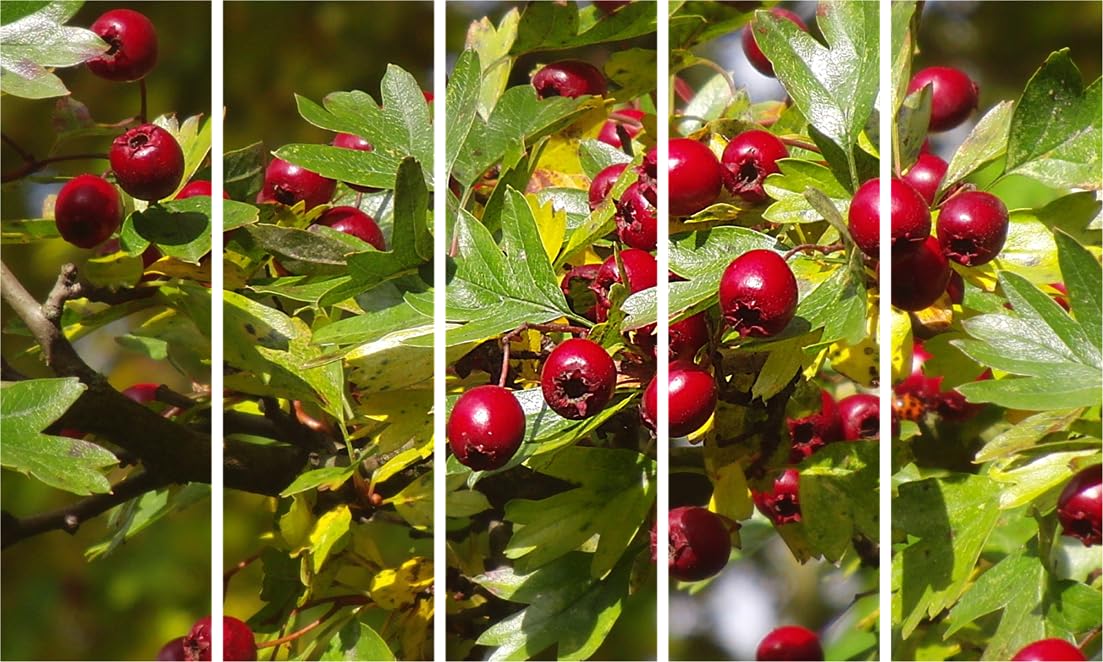
Your walls are probably cream, off-white, or that builder's beige that comes standard in most Indian apartments. Good news: the deep crimson berries in this piece create natural contrast against neutral walls without clashing.
Against cream walls: The red pops forward, creating depth. The green foliage recedes slightly, adding dimension without overwhelming.
With brown furniture: If you have that typical Indian living room setup—dark wooden coffee table, brown or beige fabric sofa—these berry reds and forest greens complement rather than compete. The warm undertones in the red berries pick up the warmth in wooden furniture.
In different lighting: Morning sunlight through east-facing windows will make the greens appear more vivid and the reds slightly warmer. Evening LED lighting (that 4000K warm white most Indian homes use) deepens the reds to almost burgundy—richer, moodier.
The white/blurred background element: This matters because it prevents the art from feeling heavy. The soft bokeh background in sections of the panels lets your cream walls "breathe through," so the piece integrates rather than dominates.
Here's what you're actually dealing with:
Weight: 3kg total across 5 panels—that's 600 grams per panel, lighter than a large hardcover book. Standard drywall anchors handle this easily; you don't need to find studs.
Panel spacing: Each panel hangs independently. Maintain 2-3cm gaps between panels for the signature multi-frame effect. Use a level app on your phone—works better than eyeballing.
Rental-friendly option: Worried about your ₹50,000 deposit? Use 3M Command Picture Hanging Strips rated for 3kg. Four strips per panel. When you move out, they peel off without marks. The small holes from screws can be filled with white toothpaste before inspection—old tenant trick that actually works.
The splash-proof finish: This piece has moisture-resistant coating, so if your living room connects to your kitchen (common in 2BHK layouts), cooking steam and monsoon humidity (70-85% in July-August) won't warp or yellow the canvas over time.
You've probably saved multiple sizes in your cart. Here's the honest breakdown:
vs. 90cm variants: Smaller pieces cost less (usually ₹500-800 difference), but on a 12ft wall, 90cm reads as "starter apartment décor." Fine for bedrooms or study rooms under 10ft wide—undersized for main living areas.
vs. 150cm variants: Larger pieces make stronger statements but need rooms over 14ft wide to breathe properly. In a standard 12x14ft living room, 150cm can feel like the art is advancing toward you rather than decorating your wall.
vs. single-panel art at 127cm: Single panels at this size look flat—one rectangle of color. The 5-panel split creates visual rhythm, makes the image feel cinematic, and tricks the eye into perceiving more dimension than a flat canvas delivers.
vs. marketplace canvas at ₹800: Those use 200 GSM synthetic canvas with inkjet prints that fade in 18 months. This uses 340 GSM cotton canvas with eco-solvent UV-resistant inks—the colors you see today will look the same in 5 years.
In morning light (east-facing rooms): The berries appear bright red, almost cherry-like. Greens look fresh and saturated. High contrast, high energy.
In afternoon light (north-facing rooms): More neutral, true-to-image colors. This is probably what the product photo represents.
In evening LED light: Reds deepen toward burgundy. Greens mute slightly. The overall effect is warmer, more intimate—good for evening relaxation.
From 3 meters away (seated on sofa): You'll see the overall composition—the sweep of red berries across green foliage. The 5-panel breaks create visual interest that holds attention longer than single-panel art.
From 1 meter away (walking past): You'll notice the photography detail—individual berry textures, leaf veins, the bokeh blur in the background. This is where the 340 GSM canvas texture adds tactile interest.
What guests will notice: The multi-panel format reads as "deliberate interior design choice" rather than "bought something off the internet." The nature theme is universally inoffensive—works for everyone from your mother-in-law to your colleagues.